
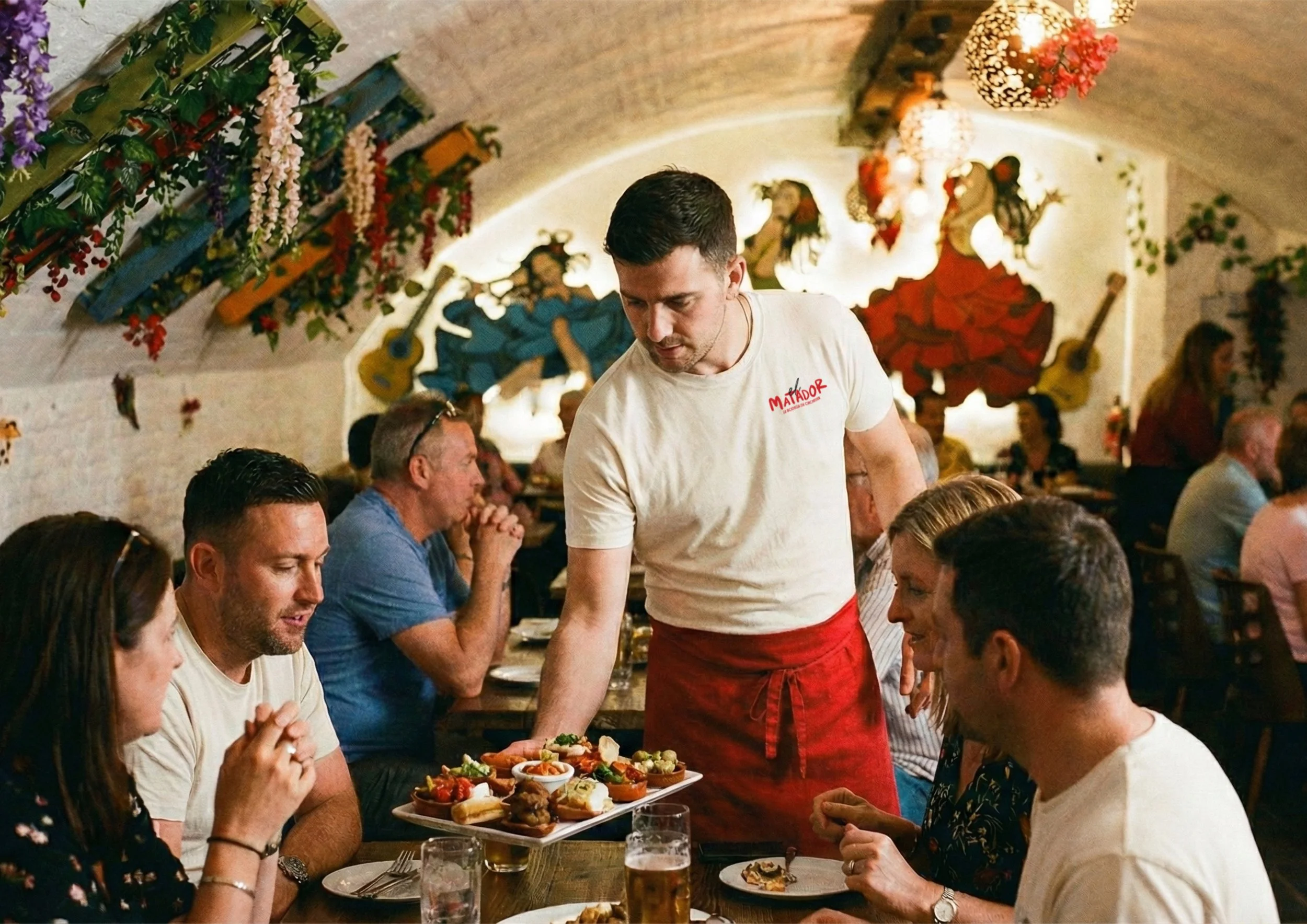
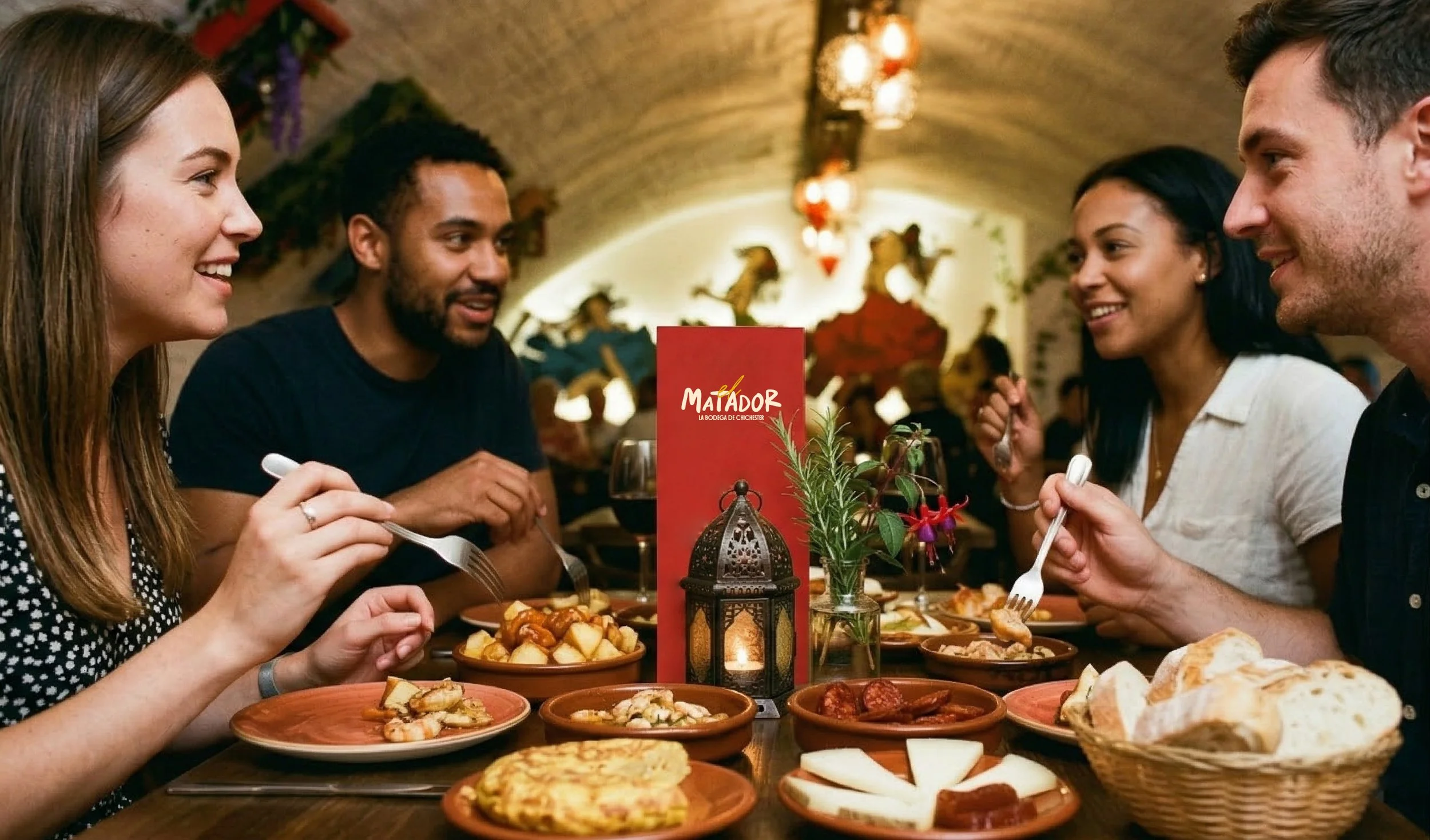
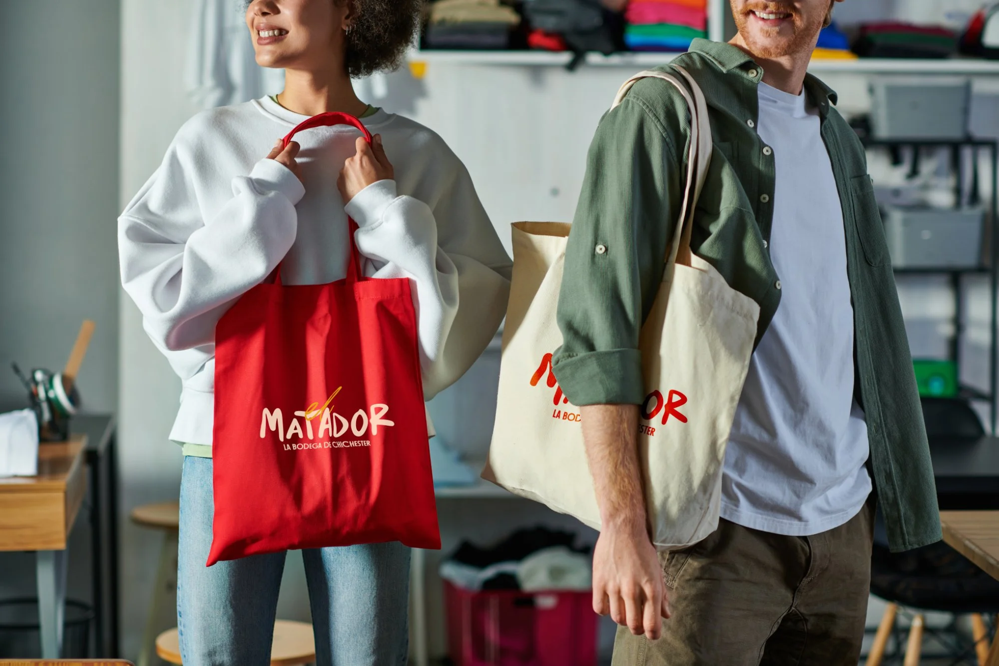
We worked with El Matador to develop a brand identity that would modernise their marketing, while retaining the authenticity, warmth and energy that Spanish hospitality is synonymous with.
At its heart, El Matador is about authentic, unpretentious Spanish flavours. We designed the logo to mirror the dining experience, a contemporary take on traditional Spanish aesthetics that is full of life and character, without being overpowering. It’s bold, energetic and rooted in nostalgic Spanish design.

Full case study coming soon….